Showing posts with label Comparison. Show all posts

Monday, June 7, 2010

Finger Paints "Scenery Greenery"


Happy Monday my friends! Thanks for checking in today!!!! I have a fun green to share with you today. Since I cannot find Essie's Pretty Edgy ANYWHERE I am trying to fulfill my longing for a good green but I doubt anything will be as perfect as that one. The search continues...

So I picked up Scenery Greenery by Finger Paints a few weeks ago at Sally Beauty Supply. It's a great dark forest green creme. It's almost black but not quite, I have a few other dark greens which are even closer to black than this one so this one is a nice middle of the road dark green.

I will do a comprehensive green comparison at some point, maybe once I find Pretty Edgy but until then I did take a photo of the bottle compared to OPI's Jade is the New Black so you can get an idea of the tone.


The formula kind of sucks. It's super thick and gets pretty goopy around the rim of the bottle and on the brush. It can be difficult to work with as you put the initial glob of color on your nail and it is so thick it sort of just goops up before you can spread it out. I was able to make it look decent with a lot of clean up and a good topcoat. I just wish the formula was a little better.


So what do you think of this green? Do you like Finger Paints polishes? What colors do you like from them? What do you think of the formula? Sound off in the comments, I love hearing from you!!!!! Enjoy your week everyone and thanks for taking time out of your day to read and comment! Love you all! :-)

Prim and Polished


Pin It Now!

Monday, May 24, 2010

Pure Ice "Free Spirit"

Happy Monday readers!!! Today I have a GORGEOUS mint green for you all. I am not totally on top of trends but I think these baby/pastel mints are still on trend and this is a fantastic one and it's only $2.00-$2.50 and readily available at Walmart. Yay!

This is Pure Ice's Free Spirit. It's the most beautiful mint green creme. I love the color. It's a bit more green than China Glaze's Re-fresh Mint. Re-Fresh Mint is more of a true pastel with more white in it than this one.

The formula is perfection. I am always so impressed with the quality of these polishes. Pure Ice is inexpensive but not cheap! The formula is infinitely better than Re-Fresh Mint. It was opaque in two coats and the finish was smooth with no streaks. I find Pure Ice to be pretty long wearing as well.


I think if you're still digging mint greens you should wander over to the cosmetics section next time you're in Walmart. I don't think this color will disappoint you.

Note: Like other Pure Ice colors (see Taupe Drawer post here) there is another color in the collection called Free Spirit and it is in fact green. However it is different. It has a shimmer to it and it's a brighter green. I am not sure if one of them is old and one of them is new. I don't really know why Pure Ice does this. I should have picked up the other one for comparison purposes as it's only $2 but $2 is $2 and I wasn't feeling the color so I didn't get it. But just a heads up in case you happen to see Free Spirit and wonder what the heck I was talking about it being mint green!

Prim and Polished

Pin It Now!

Monday, April 19, 2010

Upcoming Collections: Essie 2010 Resort Collection. Swatches Part I: "Lapis of Luxury" and "Turquoise & Caicos"

Today I am bringing you 1/2 of the Essie Resort Collection: "Lapis of Luxury" and "Turquoise & Caicos". Enjoy! (Please excuse my broken middle finger nail :( )


"Lapis of Luxury" is described by Essie as "a dreamy ocean blue". I think this color is a nice dusty sort of cornflower blue high gloss creme. It's really quite pretty and I think will be one of the popular ones in the collection.

The formula on this (and the rest of the collection surprisingly) is impeccable. I love how these all just glide on. I did not have a bit of trouble applying this at all. It was opaque in just 2 coats and the finish was really beautiful and shiny. Essie seems to be hit or miss formula wise but this is a great hit in my book. Smooth and just perfect.

Here's a look at the color in the regular sunshine and in direct sun:


As soon as I saw this color I thought of Orly "Snowcone" from their spring collection. Sure enough when I pulled it out it was quite similar indeed. I did a little swatching to show you the two side by side:

As you can see they are nearly identical. Here's my 2 cents on these. The Orly is highly pigmented and if you're careful in application you're able to achieve maximum opacity in just one coat, however I found the Orly a little difficult to work with because it's so pigmented and thick. I prefer the slightly thinner formulation the Essie polish offers. It's really just a matter of personal preference. They're similar in price in stores, you're likely to pay $6.99 for the Orly and $8 for the Essie so it's a tossup. If you love the color and can only get your hands on one or the other I'd say they are close enough to be considered dupes. Essie wins out in my book because the formula is superior and the shiny finish just sends it over the edge for me. Hope this helped.

Now on to a different island... this is "Turquoise & Caicos" I believe this polish will be the most popular one in the collection and I am telling you, at least in my collection, this one is unique and beautiful!

"Turquoise & Caicos" is described by Essie as "a flirty and pretty tropical aqua". It's a really great color and one I find to be quite unique among the aqua/teal/green/blue colors in my collection.

Again, the formula is outstanding on this one. It's almost jelly like but not quite. It required three coats for maximum opacity and the final result is gorgeous. I say it's almost jelly like because the finish is pretty and squishy looking but it is not at all transparent so it's not really a jelly. It's just a perfect high gloss creme. I love it!

I pulled a few polishes that are in the same color family but I didn't do actual swatches. I hope you find the bottle comparisons helpful. As you can see there really is no dupe in my collection.

First we have China Glaze's "Four Leaf Clover" and Essie's "Turquoise & Caicos" these are not even close at all. The China Glaze is more green and darker (even more so in real life):

Next I have China Glaze's "Re-Freshmint" and Essie's "Turquoise & Caicos". As you can see "Turquoise & Caicos" is not a mint green. It's more blue than mint but it's not blue if that makes sense:

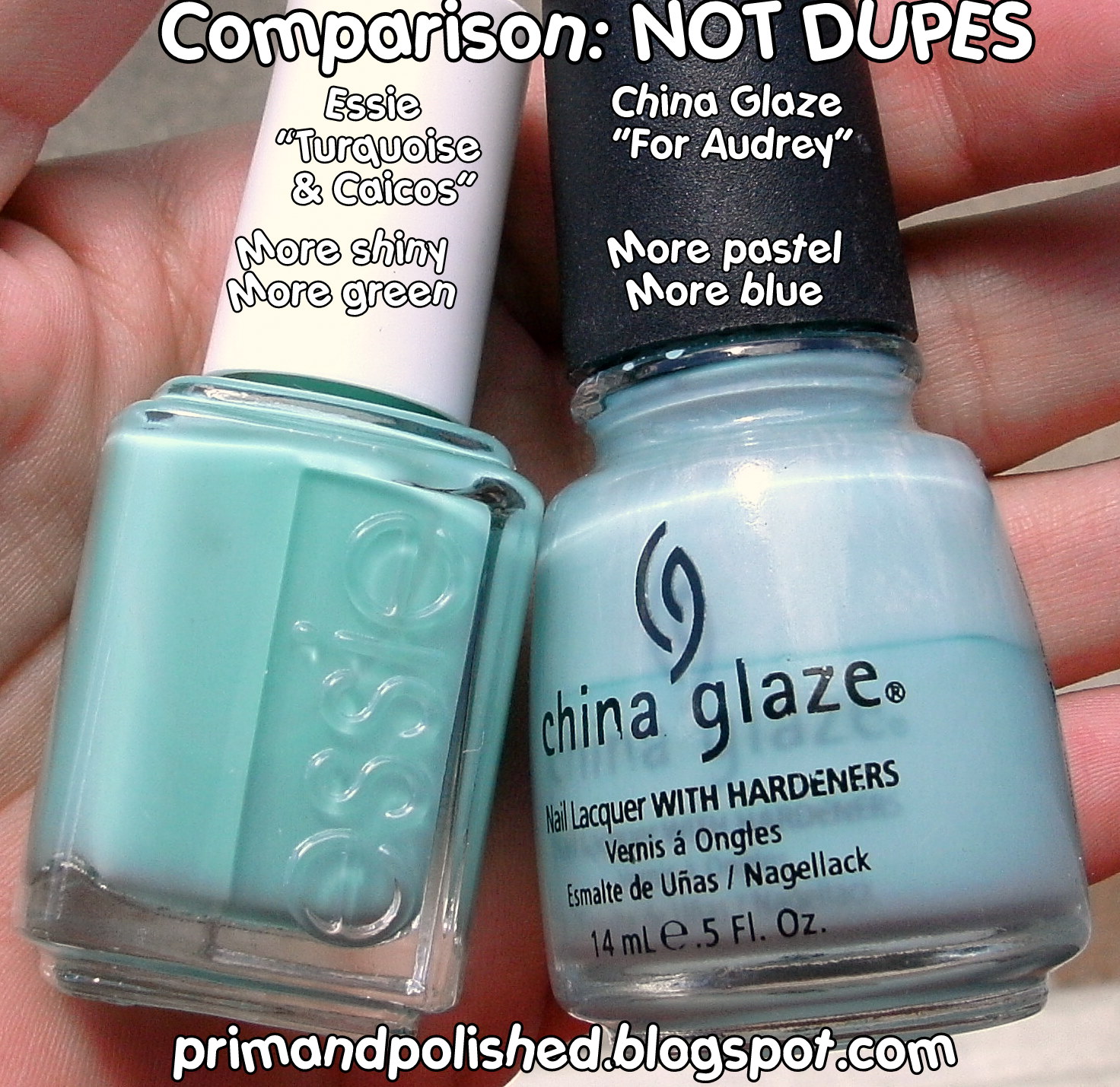
Now we have China Glaze's "For Audrey" and Essie's "Turquoise & Caicos" these look closer in the bottle but they are not dupes. You all know what "For Audrey" looks like on the nails so see my "Turquoise & Caicos" swatches above and you'll know they are not the same. "For Audrey" is more on the pastel side, it's lighter than "Turquoise & Caicos" and more baby blue-ish.

And finally just a shot with it in the middle to give you an idea of where it is on the color spectrum:

I hope this helped you. Stay tuned tomorrow for the other two polishes in this collection. I love these colors and I think many of you will too.

This collection is supposed to be available in May but I think it's available right now. I saw it at Ulta (we finally got an Ulta in my state!!!!) and I think you can get it HERE too.

Prim and Polished

Disclosure: This collection was furnished to me by Essie for consideration. All reviews published on this blog are at my own discretion. Please refer to my Disclosure Policy.

Pin It Now!

Tuesday, April 6, 2010

Color Club: Gossip Column


Color Club's "Gossip Column" is a medium toned blue creme from the Rebel Debutante collection. It's actually a pretty unique shade of blue in my opinion. (See some basic comparisons below). It's slighty "dusty" which is a quality I like in colors.


The formula of this polish is fantastic. It's SUPER pigmented and if you're precise with application I think you can totally get opaque coverage in one coat. I used two coats to even out my application. Being that it's so pigmented it's on the thick side so it can be slightly tricky to work with but if you're a careful polisher you'll be fine, I didn't find it frustrating at all.


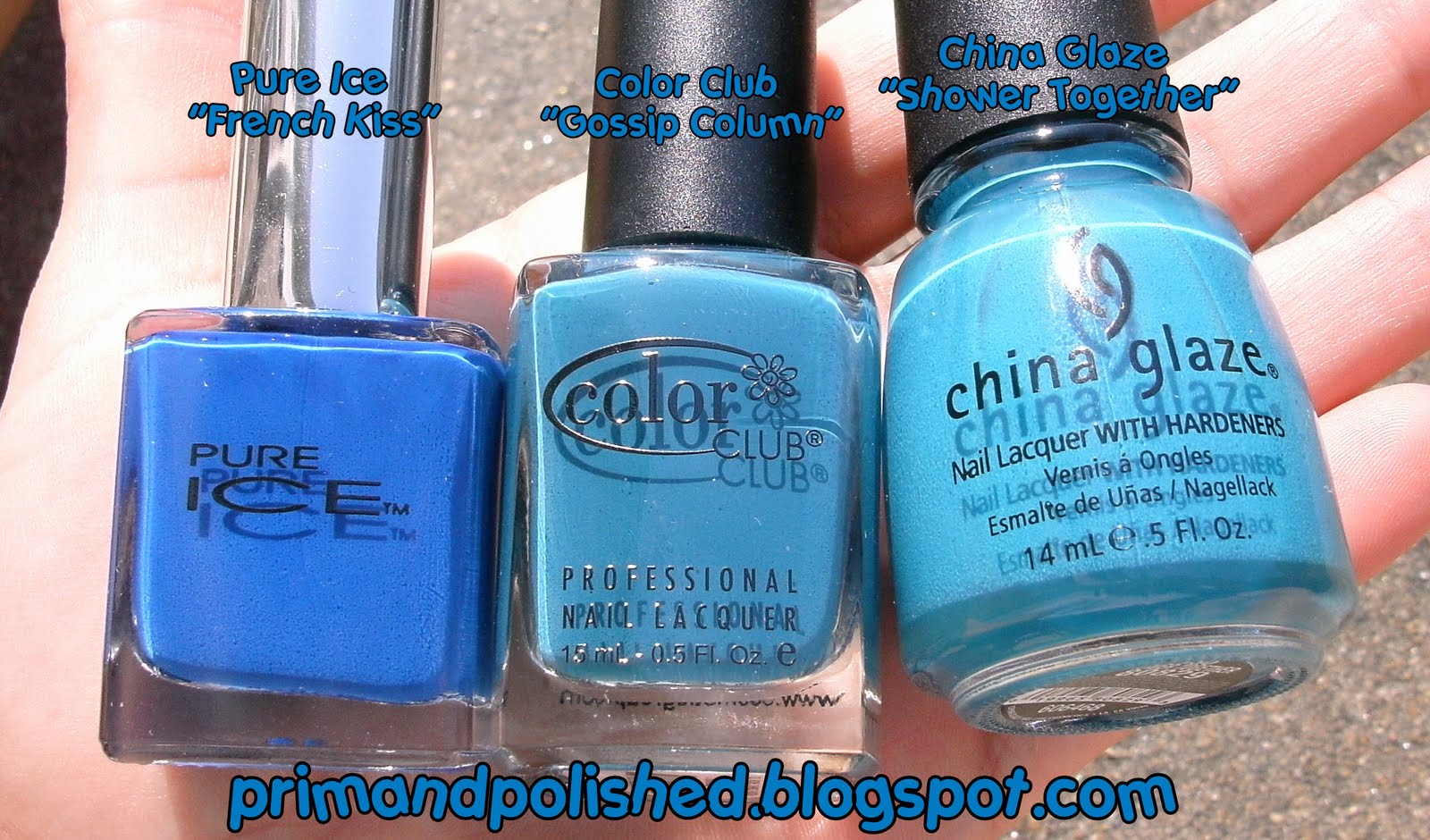
Just to compare the colors a bit. The Pure Ice color is a true royal blue and the China Glaze shade leans toward Aqua. I just wanted to show you where on the spectrum "Gossip Column" lies. Hope this helps.


So are you a fan of blue nails? I am! My husband always likes them too for some reason. What do you think about "Gossip Column"?

Prim and Polished

Disclosure: "Gossip Column" was furnished to me by Color Club (Forsythe Cosmetic Group) for consideration. All reviews published on this blog are at my own discretion. Please refer to my Disclosure Policy.

Pin It Now!

Monday, March 15, 2010

China Glaze: Sci-Fi

China Glaze's "Sci-Fi" is part of the Khrome Collection and it's a fantastic metallic silver color. It has an almost aluminum foil quality to it in that it is incredibly shiny. I don't normally go for colors like this because I tend to favor creme formulas but this one actually worked out very nicely on my nails.


I think you should absolutely use a ridge filling base coat like Beauty Secrets Ridge Filler when wearing metallics because the texture of these polishes tend to emphasize any imperfections in the nail bed and will only drive you mad if you're a manicure perfectionist. A good ridge filling base will help a metallic polish go on more smoothly and the end result will be much more pleasing to the eye.


This polish applied nicely (over my ridge filler) and I used just two coats. It was opaque in just one coat but I like to use two to fix up any sloppy application. The consistency of this polish is thin but pigmented. It's almost like molten metal. It was a rather easy to work with polish and I have a love for China Glaze's brushes so that helped.

Metallic polishes also work well with Konad stamping. Now me and Konad do not get along so I tend not to even bother trying (what a waste of $ that was on my part) but many people tend to have success with Khrome polishes and Konad.


A Quick Comparison


The only other silver I have in my collection is Orly's "Silver Mine". I could have sworn I had a Pure Ice Silver color from years ago but I must have thrown it away. Oh well. I thought I'd show you some side by side pics of the two colors. They're very similar and pretty much the same consistency, with the Orly being maybe just a tiny but thinner. The China Glaze is slightly, very slightly darker.


So what do you think of "Sci-Fi"? Do you have any polishes from the Khrome collection? I have this one and "2030" which is gold. Are you a fan of metallics?!


Prim and Polished

Disclosure: "Sci-Fi" was furnished to me by China Glaze for consideration. All reviews published on this blog are at my own discretion. Please refer to my Disclosure Policy.

Pin It Now!

Monday, February 1, 2010

Pastel Yellow Comparison Featuring "Lemonade" & "Lemon Fizz"


Today's post is a comparison of two pastel yellow colors from two companies' spring collections. We have China Glaze's "Lemon Fizz" from the Up & Away Collection and Orly's "Lemonade" from the Spring II Sweets Collection coming in April. As you can see from the photos below the two colors are quite similar. China Glaze's "Lemon Fizz" is a teeny tiny bit warmer but I feel like you can really only see that warmth in the photo comparing the bottles:


On the nails I feel like the colors are almost identical. If you look closely enough you can see the slightly warmer tone on the China Glaze but honestly these are essentially dead on dupes. I actually enjoy this color, I was not sure how I'd feel about yellow nails but this color yellow is actually quite pretty!


As far as the formulas go they are quite different. I feel like the Orly is thick and the China Glaze was thin. Pastels and yellows are both known for their finicky application as they often are streaky. I feel like these two were actually both pretty nice applications though I think the Orly has a very slight edge in application. The Orly was thick and applied pretty smoothly, almost no streaking. The China Glaze was much thinner and on the first coat was quite streaky but that completely evened out upon second coat. Overall both polishes performed well for pastel yellows. The difference was not enough for me to say I prefer one over the other. The final look of both polishes was smooth and streak free.

If you're looking for a nice pastel yellow either of these two will satisfy your craving. I feel like you cannot go wrong with either one as the differences are negligible. Besides the tiny difference in application and slightly warmer hue of the China Glaze they're great dupes. So if you can get one but not the other don't fret.


China Glaze's "Lemon Fizz" is available now from places like Sally Beauty Supply and Trans Design. Orly's "Lemonade" will be available in April 2010 and comes with the matching lip gloss seen in the photo (smells like lemons).


Disclosure: "Lemonade" was furnished to me by Orly for consideration. All reviews published on this blog are at my own discretion. Please refer to my Disclosure Policy.


Prim and PolishedPin It Now!

Tuesday, January 19, 2010

China Glaze: Four Leaf Clover (Up & Away Collection)

"Four Leaf Clover" by China Glaze is part of the new Up & Away Collection which launched this month. Like I have mentioned before I was super excited about this collection because I LOVE cremes and I love the color palette of this collection (soft pastels and a few brights). I ended up purchasing the entire collection, which is something I have never done before, but I couldn't resist. I almost skipped this color. I wasn't sure how I felt about a "kelly green" but I am so so happy I didn't skip this as it's actually one of my favorites from the collection.

This is a beautiful bright creme green. It borders on neon but is not quite as bright as a neon. The photos here are two coats which was perfect opacity. The formula is wonderful, I love China Glaze polishes. I love the normal sized brush (compared to the nightmare OPI brush) and I find the application to be easy and neat. Note, much less pooling around the cuticle. I think this polish is a true winner so if you think you'd like the color I say go pick this up.

(As always click on photos to enlarge. Please see below for comparison of "Four Leaf Clover" and "Turned up Turquoise").


Comparison: "Turned up Turquoise" & "Four Leaf Clover


Now I mentioned to Nicole yesterday on Twitter that "Four Leaf Clover" is like the creme version of "Turned Up Turquoise" so I thought I'd show you them side by side. In hindsight I should I have done a nail on nail comparison but I was lazy. You cannot see the differences very clearly in the photos below but what you can see is the similarities.

"Turned Up Turquoise" is a neon, which means it's super bright and highly pigmented. What you cannot see in the comparison photos is that "Turned up Turquoise" has a slight shimmer to it. I am not sure how to describe it but it's got some fine shimmer particles which are the same color as the polish, hence why you cannot see it in the pictures. I hope that makes sense.

"Four Leaf Clover" is a true creme. There is no shimmer in it whatsoever. It's a smooth green color.

Do you need both? I'd say yes. They are NOT dupes. They are the same "color" but they are not the same finish at all. One is a high gloss creme the other is a shimmery neon. I know the photos look similar but I assure you there is a HUGE difference in these colors.


What do you think of "Four Leaf Clover"?

Prim and PolishedPin It Now!