Showing posts with label aqua. Show all posts

Monday, August 2, 2010

Deborah Lippmann: "Don't Tell Mama"

It's August already! Where oh where does the time go?

Today I have a gorgeous green color to share with you from Deborah Lippmann called Don't Tell Mama. Lippmann calls it "mood ring blue/green shimmer" and it totally does remind me of a mood ring! It's really quite gorgeous. It's deep, almost black, and complex. In some lights I see green, in some I see blue, it's like a mermaid fin! I just love it!!!

The formula is outstanding, and with a price tag of $16-$18 it better be! I really think you could tell it's high end. It applied flawlessly and it lasted for days! I took it off around day four but I had virtually no tip wear and no major chipping at all, I just wanted to change it. So the staying power to me is A+.

I went a little pic crazy, but I feel like each pic is slightly different so I had to post them all. Sorry in advance for that!


So what do you think? Worth splurging for? I really love it, I think if you're looking to spoil yourself Lippmann lacquers are a good way to do it. I really am impressed with the quality of these. I am sure I won't be running out and buying all of them (with the job situation LOL) but I do see some more in my future. You can purchase these on Deborah Lippman's website or at Nordstrom.
Prim and Polished
Disclosure: This polish was furnished to me by PR for consideration. All reviews published on this blog are at my own discretion. Please refer to my Disclosure Policy.
Pin It Now!

Monday, July 19, 2010

A Beautiful Life Natural Lacquer Swatches and Review


Go Green! Last week I talked to you about the nail polish remover by A Beautiful Life and today I want to review two polishes from their line.


These polishes are Big 3 Free, non toxic, soy based and come in recyclable bottles. Like I mentioned when I talked about the polish remover I think this concept is really interesting and really smart. We put so many chemicals on our bodies in order to look beautiful it's refreshing to know a product isn't harming us or the environment!

The company offers a variety of different colors to choose from. Here's an image from their website showing the color selections:
Justify Full


I have Vette and 'Shroom. Vette is a glossy robin's egg blue, similar to For Audrey by China Glaze. 'Shroom is a shimmer champagne gold color which is work appropriate and pretty.

I really like 'Shroom. Now you know I do not typically like shimmery/frost colors but I do really like this one. It's similar to a really OLD Sally Hansen color I used to wear all the time in high school. The color is a clean gold champagne which I would consider a nice work/school appropriate neutral.

I had no issues with application. I found the formula to be easy to work with. I got no streaking and no clumps or anything. It wasn't too thick and wasn't too thin. Here's a swatch:


Next is Vette which is a color I think a lot of you will like. It's a robin's egg blue similar in tone to China Glaze's For Audrey which I know is a huge favorite among lacquer fiends.

This polish is my favorite finish, creme. It's really opaque and if you're careful enough you might get full opacity in one coat but I used two which is fine with me.

The formula was nice, a little thicker than the shimmer but that's usually the case. I had no application problems and it wasn't messy. Overall impressed. Here are some swatches and color comparisons so you can get an idea of the color. Hope these help.

Click images to enlarge:


Overall I am happy with the products I have tried from this company. Like I said it's nice to see a company being eco-responsible and putting out high quality products. If you want to check out A Beautiful Life polishes yourself just head to their website. They retail for $12.

Sound off!!! Is being non-toxic, eco-friendly something you look for in nail products? Do you think we'll see more companies moving in this direction?

Thanks for reading and have a wonderful day.

Prim and Polished

Disclosure: This product was furnished to me by PR for consideration. All reviews published on this blog are at my own discretion. Please refer to my Disclosure Policy.


Pin It Now!

Monday, April 19, 2010

Upcoming Collections: Essie 2010 Resort Collection. Swatches Part I: "Lapis of Luxury" and "Turquoise & Caicos"

Today I am bringing you 1/2 of the Essie Resort Collection: "Lapis of Luxury" and "Turquoise & Caicos". Enjoy! (Please excuse my broken middle finger nail :( )


"Lapis of Luxury" is described by Essie as "a dreamy ocean blue". I think this color is a nice dusty sort of cornflower blue high gloss creme. It's really quite pretty and I think will be one of the popular ones in the collection.

The formula on this (and the rest of the collection surprisingly) is impeccable. I love how these all just glide on. I did not have a bit of trouble applying this at all. It was opaque in just 2 coats and the finish was really beautiful and shiny. Essie seems to be hit or miss formula wise but this is a great hit in my book. Smooth and just perfect.

Here's a look at the color in the regular sunshine and in direct sun:


As soon as I saw this color I thought of Orly "Snowcone" from their spring collection. Sure enough when I pulled it out it was quite similar indeed. I did a little swatching to show you the two side by side:

As you can see they are nearly identical. Here's my 2 cents on these. The Orly is highly pigmented and if you're careful in application you're able to achieve maximum opacity in just one coat, however I found the Orly a little difficult to work with because it's so pigmented and thick. I prefer the slightly thinner formulation the Essie polish offers. It's really just a matter of personal preference. They're similar in price in stores, you're likely to pay $6.99 for the Orly and $8 for the Essie so it's a tossup. If you love the color and can only get your hands on one or the other I'd say they are close enough to be considered dupes. Essie wins out in my book because the formula is superior and the shiny finish just sends it over the edge for me. Hope this helped.

Now on to a different island... this is "Turquoise & Caicos" I believe this polish will be the most popular one in the collection and I am telling you, at least in my collection, this one is unique and beautiful!

"Turquoise & Caicos" is described by Essie as "a flirty and pretty tropical aqua". It's a really great color and one I find to be quite unique among the aqua/teal/green/blue colors in my collection.

Again, the formula is outstanding on this one. It's almost jelly like but not quite. It required three coats for maximum opacity and the final result is gorgeous. I say it's almost jelly like because the finish is pretty and squishy looking but it is not at all transparent so it's not really a jelly. It's just a perfect high gloss creme. I love it!

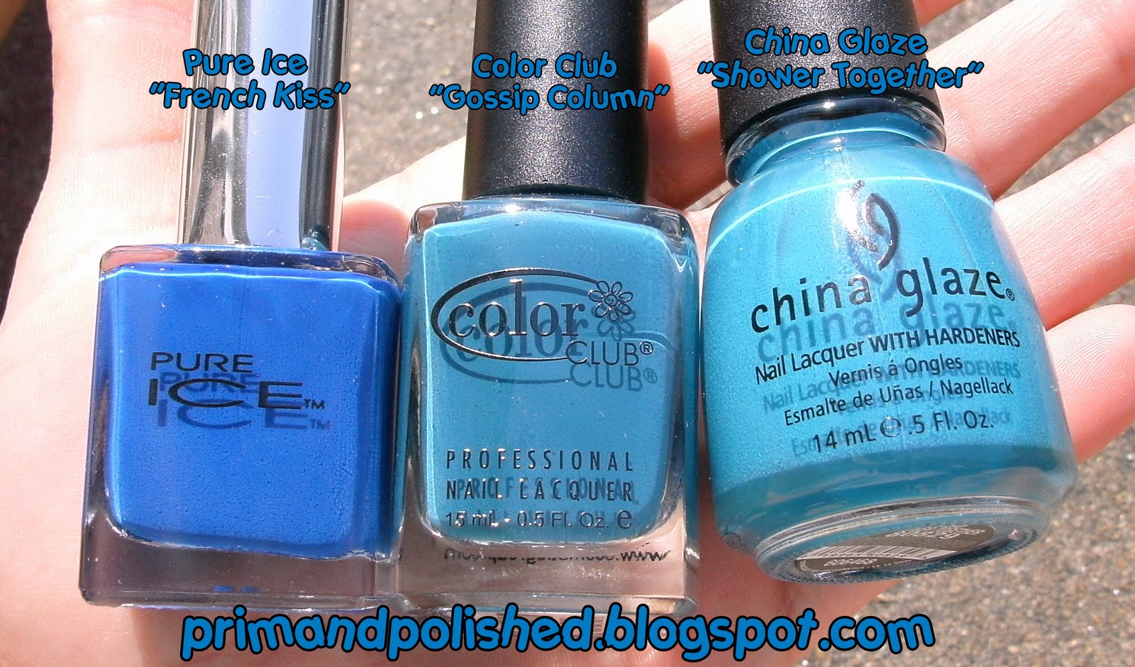
I pulled a few polishes that are in the same color family but I didn't do actual swatches. I hope you find the bottle comparisons helpful. As you can see there really is no dupe in my collection.

First we have China Glaze's "Four Leaf Clover" and Essie's "Turquoise & Caicos" these are not even close at all. The China Glaze is more green and darker (even more so in real life):

Next I have China Glaze's "Re-Freshmint" and Essie's "Turquoise & Caicos". As you can see "Turquoise & Caicos" is not a mint green. It's more blue than mint but it's not blue if that makes sense:

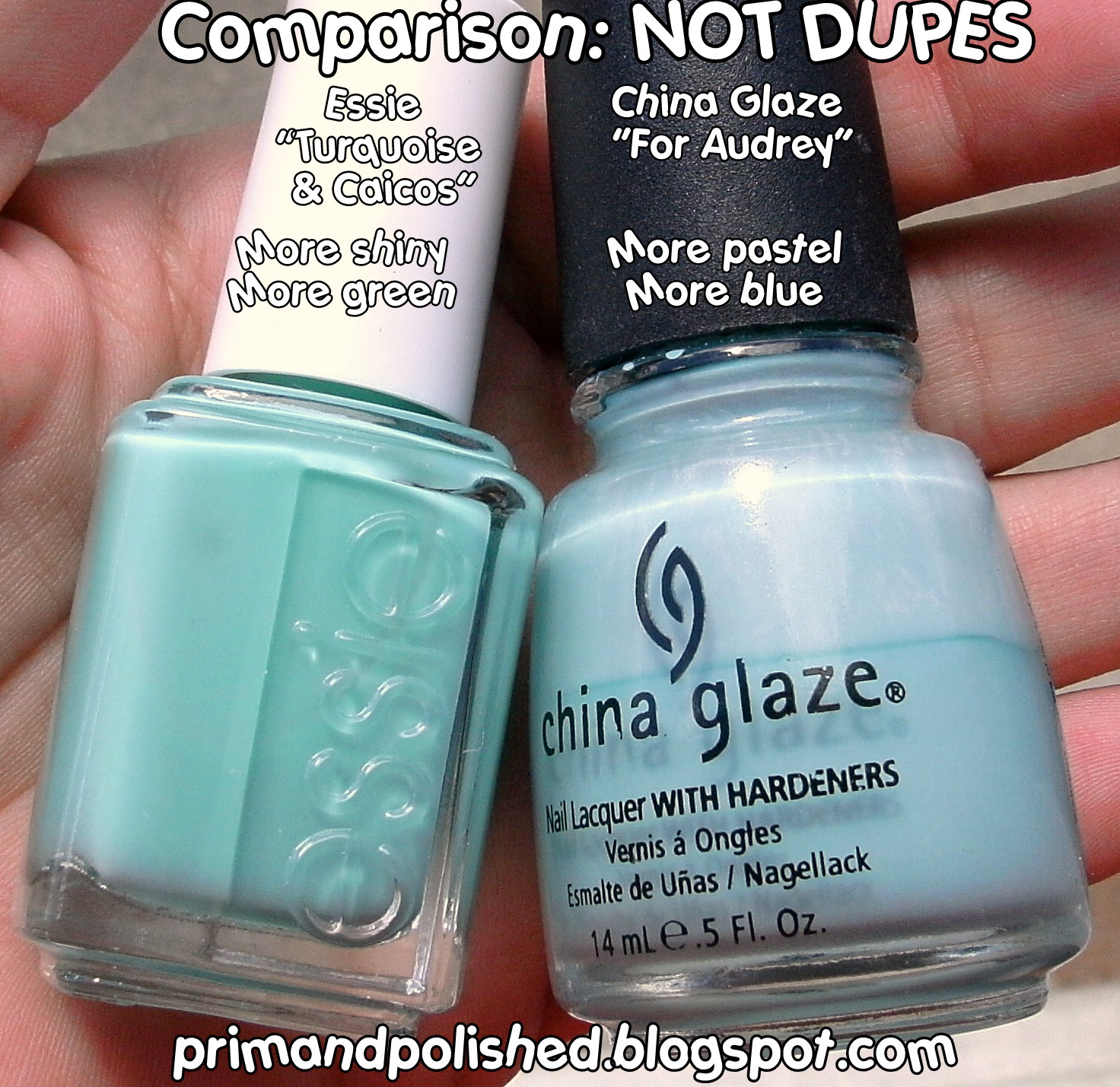
Now we have China Glaze's "For Audrey" and Essie's "Turquoise & Caicos" these look closer in the bottle but they are not dupes. You all know what "For Audrey" looks like on the nails so see my "Turquoise & Caicos" swatches above and you'll know they are not the same. "For Audrey" is more on the pastel side, it's lighter than "Turquoise & Caicos" and more baby blue-ish.

And finally just a shot with it in the middle to give you an idea of where it is on the color spectrum:

I hope this helped you. Stay tuned tomorrow for the other two polishes in this collection. I love these colors and I think many of you will too.

This collection is supposed to be available in May but I think it's available right now. I saw it at Ulta (we finally got an Ulta in my state!!!!) and I think you can get it HERE too.

Prim and Polished

Disclosure: This collection was furnished to me by Essie for consideration. All reviews published on this blog are at my own discretion. Please refer to my Disclosure Policy.

Pin It Now!

Tuesday, April 6, 2010

Color Club: Gossip Column


Color Club's "Gossip Column" is a medium toned blue creme from the Rebel Debutante collection. It's actually a pretty unique shade of blue in my opinion. (See some basic comparisons below). It's slighty "dusty" which is a quality I like in colors.


The formula of this polish is fantastic. It's SUPER pigmented and if you're precise with application I think you can totally get opaque coverage in one coat. I used two coats to even out my application. Being that it's so pigmented it's on the thick side so it can be slightly tricky to work with but if you're a careful polisher you'll be fine, I didn't find it frustrating at all.


Just to compare the colors a bit. The Pure Ice color is a true royal blue and the China Glaze shade leans toward Aqua. I just wanted to show you where on the spectrum "Gossip Column" lies. Hope this helps.


So are you a fan of blue nails? I am! My husband always likes them too for some reason. What do you think about "Gossip Column"?

Prim and Polished

Disclosure: "Gossip Column" was furnished to me by Color Club (Forsythe Cosmetic Group) for consideration. All reviews published on this blog are at my own discretion. Please refer to my Disclosure Policy.

Pin It Now!

Thursday, April 1, 2010

Upcoming Collections: China Glaze "Poolside": Summer 2010. Swatches Part 3: "Kiwi Cool-Ada" and "Towel Boy Toy"

Alright today is the last of the Poolside swatches and I think I saved the best for last, the blue and the green are great colors!!

First we have "Kiwi Cool- Ada" which is a vibrant neon green. This might not be a color I'd wear all the time but I really like the color a lot. I think the photos are pretty accurate. These were taken in overcast weather but they seem to be correct.

This one was easier to apply than many of the other ones which was nice. I did need 3 coats and I did have some slight VNL on this one though. Ewww hate VNL.


And last but not least is one of my favorite of the bunch, "Towel Boy Toy". This is a vibrant cerulean type blue and this is the only of the bunch that has a slight duochrome to it. The duochrome is blue and very very subtle, but it's there (trust me LOL).

This one applied best of the bunch. I did need 3 coats for opacity but it is OPAQUE! No VNL yay. The formula was easy to work with and not really streaky. Winner of the bunch.

I had GREAT sunshine for the swatches on this one so they are the most accurate of the bunch and I am a happy girl because it's nice out! yay!


The whole collection in all it's glory:

So there you have it. All of the China Glaze Poolside collection. This collection should be available today, April 1, 2010 (no joke ha!). I hope the swatches helped you decide if this is a collection for you. What do you think? Getting any?


Prim and Polished

Disclosure: This collection was furnished to me by China Glaze for consideration. All reviews published on this blog are at my own discretion. Please refer to my Disclosure Policy.


Pin It Now!

Wednesday, March 24, 2010

China Glaze: "Atlantis" and Glitter Removal.


China Glaze's "Atlantis" is a stunning turquoise jelly with amazing holographic rainbow glitter particles. This color is part of the specialty glitters and cremes collection. I am not sure if these are permanent or will be limited edition but currently it is still for sale on Trans Design. I almost skipped this one but I am so glad I didn't because it's really as beautiful as everyone says!

The formula is easy to work with. The base is a squishy turquoise jelly that applies well. I used three coats for opacity and I think it was enough. I used two coats of Seche Vite Top coat in order to smooth out the chunky glitter. Without the top coat this will be a pretty rough texture.

When the light hits the glitter in this polish it's one of the most gorgeous things. The glitter flashes all of the colors of the rainbow. It was difficult to capture that in photos but I took some out of focus ones to show it:


I find glitters to chip significantly faster than most other polish formulas but this one did not. I wore it for almost 5 days (that's how pretty it is) and had minor tip wear but no significant chunks were missing.

I am very impressed with this polish and glad I thought twice before passing it up. I think it's one of the best glitter polishes in my collection.


Glitter removal can be a pain but I was able to remove this without breaking a sweat using the foil method I have seen on other polish bloggers blogs. Just soak a cotton round in polish remover, place a round on each nail and wrap the nail and cotton with foil. Let stand for about 3-4 minutes. Apply slight pressure on the nail when removing the cotton and foil and you should have a fairly clean nail when finished. Much better than using 1/2 bottle of remover and a bag of cotton rounds.


I love this method! Whoever thought of it, thank you!!! There's very minimal cleanup required after it, just a teeny bit of stray polish. Try it next time you rock the glitter. Don't let glitter removal keep you from wearing your favorite glitter polishes.

What do you think of Atlantis? Did you pick it up? Have you tried the foil removal method? Let me know, I love to hear from you all!!!

Prim and Polished

Pin It Now!